Thursday, January 30, 2025

Post Production - Editing

 Here is the development of the editing stage - completed by Giorgio ("I" refers to Giorgio since I didn't really involve myself in the editing) 


I used Google Drive to store all the footage that was filmed using my Leica smartphone camera. I used movie ratio during filming directly so that I won't have to add an effect or change the ratio later on during editing.


I'm using Capcut to edit the Music Video (MV). Capcut offers many premade effects and editing tools. It's very easy to use, easy to learn, and practical. I have been using CapCut for almost 2 recent years, so I'm fairly good at it and still familiar with it. I have bought CapCut Pro which gives me access to more features and effects that I normally couldn't use with normal CapCut. So, with this membership, I'm hoping I'll finish things much more smoothly and without hindrance like the limitations of normal CapCut. I will be using my computer to edit on CapCut. 


Here is the overall timeline of the project in CapCut computer. 


SIGNIFICANT EDITING CHOICES AND METHODS
The Intro will have an opening title of the song, I used a text element and animated it for the title introduction: 


The title serves to give context to the audience. 

I changed the text's color to match the branding and overall lighting.


I chose a color that compliments the background lighting and scenery. It is important to make it visually appealing so that the audience doesn't feel odd or get distracted by it leading to not being able to focus on the content. 

I use filters to color grade the footage for better quality and make it more cinematic. 

The highlighted elements are the filters:


Color grading is a very important aspect of editing as it creates meaning and stories in the media. I could make the music video seem horror and scary with dark color grading, or enunciate certain colors to create the branding of the video. As for our music video featuring J Muse covering "Leave The Door Open" I go with a filter that matches the persona of J Muse which is laid back, cool, and down-to-earth, which is why I picked a filter that enunciates the warm colors like yellow and orange, as well as ones that compliments the lighting of the footage. 

I used markers to symbolize the beats of the music/audio. It helped me with matching the timing of footage cuts and transitions. 

The audio is at the bottom, the color is blue, and the markers are on top of the audio, the color is light blue:


I use jump cut, decided on that during editing, for this scene.


EXAMPLE 1


EXAMPLE 2 


I matched the cuts based on the music's beat so that it looks smooth and not messy which is disturbing for the audience. These jump cuts were placed during a very energetic part of the music, so it suits well and creates a visual appeal or eye candy for the audience. 

MINOR EDITING CHOICES AND METHODS
I used special effects to give a dreamy look on the artist's face during part of the song where the lyrics talk about being clean-shaven.


This makes the visual more impactful and engages the audience more with the song and music video, as it immerses them better with special visual effects. 

I edited the speed of the footage to give a slow-mo effect on J Muse's expression.

I slow down his facial expression to really show and strengthen the emotion. It was right when he was blinking and looking out of the window. Simple, subtle change that really makes a difference on the mood and audience engagement and perception.

Self-Reflection:
I have no talent whatsoever in editing skills. Besides, this wasn't my task in completing this blog section. It was the other guy's job. Looking back in his work and creations, I genuinely think that he has done a great job in editing the music video, starting from the cuts, jump cuts, and slow mo effects. I believe that the one who edit this has pure talent so as a result the editing in this music video just looks godly and able to give the audience enough understanding of the music video storyline. In conclusion, I did minimum work beside to giving ideas for the editor to add some transisitions and jump cuts in the editing process.

Production: Behind The Scene

 Here are the behind the scenes of creating our music video project - completed by Jaden ("I" and "me" refers to Jaden)


PRE-FILMING
Prior to shooting, we made a schedule and planned out where we'd be going and who'd need to be bringing what. Carrick made it clear that he wanted minimal involvement in the actual filming of the project because he lived very far away in Gianyar. However, he did agree to come if an extra hand was needed. We all agreed on what I should be wearing and what sort of persona I should be giving off. It was also agreed that Kaka would take shots of behind the scenes. 

DAY 1 - HOUSE, COUCH, AND RESTAURANT SCENES (10th DECEMBER 2024)
We started at around 10:00 AM in the morning to get prepare and shoot. On this day we went to my house to shoot the house and couch scenes. Giorgio, Carrick, and Kaka were present. This is where I debuted in my JMUSE outfit, the iconic brown shirt and shorts. We then proceeded to the Soteria Restaurant (Giorgio's restaurant) to film the scenes of me waiting for a girl and drinking at the bar. Unfortunately there are no behind the scenes photos of that so I provided screenshots of the film we took there.


Giorgio brought his phone as a camera, Carrick brought a tripod, and Kaka brought lights. 


We did some shots of me on the couch, looking through my wardrobe, and leaving the house.


Scene of me going through my wardrobe.


Scene of me waiting for a girl at the restaurant


Scene of me drinking at the bar

DAY 2 - BUS SCENE (13th DECEMBER 2024)
We started sometime in the evening at the Central Kuta Bus Terminal. Only Kaka and I went and we didn't have much equipment. Kaka brought his go-pro and Carrick's tripod and I had my clothes. We filmed on the Trans Metro Dewata buses that run regular scheduled services all throughout the day. Carrick had gone to Australia for three weeks by now and Giorgio had family matters to attend to. Unfortunately no pictures were taken on this day. 

When semester two started, we found out that all the footage we took on the bus was all corrupted and we were unable to reshoot the scenes on the buses because they had already ceased all operations as of the First of January 2025. 

DAY 3 - BICYCLE BEACH SCENE (25th JANUARY 2025)
We started sometime in the afternoon at Mertasari beach in Sanur. Giorgio, Kaka, and I were all present there. We rented two bicycles and rode form Mertasari beach to Segara Ayu beach and back, ensuring we had enough footage to work with going both ways. Kaka was riding one bike with Gio on the back filming me. We also strapped a go-pro camera to my bike to film me as I was riding. We also filmed me walking around in a market on the beach. Unfortunately no behind the scenes photos were taken. Here are a few screenshots of that day's shooting.

GO-PRO VIEW


CAMERAMAN VIEW


MARKET WALK


DAY 4 - RESTAURANT AND BAND SCENE (30th JANUARY 2025)
We started in the evening after school at Giorgio's church. Giorgio was present as the cameraman, Kaka was present as an assistant as well as a background band player, and Yuka (a friend we recruited to take Carrick's place as he was not able to be present at the time) to be a background band player as well. Kaka played the keyboard, Yuka played the guitar, I sang into a microphone and Giorgio directed and filmed everything. All this was to film the band scenes of us playing and singing together. Unfortunately no behind the scenes photos were taken. Here are a few screenshots of that day's shooting.


DAY 5 - RELAXING BEACH SCENE (10th MARCH 2025)
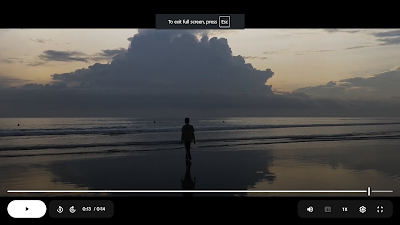
We started filming in the evening after school at Double Six beach. Giorgio was present as the director and cameraman, Kaka was present as an assistant to Giorgio and was supposed to take behind the scenes pictures, and I was present as the star. Giorgio made me do some poses on the beach and walk around to really get that beach atmosphere captured in the video. Unfortunately no behind the scenes photos were taken. Here are a few screenshots of that day's shooting.

ACTOR SITTING BY THE BEACH

ACTOR WALKING BY THE BEACH 

Self-Reflection:
Myself, as the one who was surprisingly tasked to handle the documentation for the behind the scenes images. I'm genuinely honest that I recieve lack of confirmation as I did not realize my task and role to document the behind the scenes images. I'm 100% sure that this was all a misconfirmation with me and my team due to lack of confirmation. As a result, there are less behind the scene images. Some team might blame me for having less accountability, but like I said previously, as I've been in this group for a long time, I've never had recieve enough confirmation from the team, and I knew I had to have the initiative to speak up but somehow the words gets stuck in the way everytime I'm working and coordinating in this team.  And besides I was busy directing and helping the cameramen coordinating the camera angles and positions to ensure that we get the perfect shot.

Production: File Organization

 These are the methods to organize files, folders, and labels in my group to have a better and easier production process in this project. 


Advantages of our system of organisation
  • All the footage available in one place
  • Accessible to all members of the team
Disadvantages of our system of organisation

  • No labels to determine which footage is good or bad
  • No thumbnails
  • Everything very disorganised

Advantages of using Google Drive
  • All our group members were able to access all the video files without having to uploading all the videos to a DVD drive and downloading it from the DVD drive
  • Automatically updates when someone deletes, uploads, or renames a file
  • Allows for any file type to be uploaded
  • Compatible between mobile phones and computers
Disadvantages of using Google Drive
  • Must have internet to access the files
  • No offline back up
  • Can only take up to 15gb of storage compared to DVD drives
This type of file organisation benefits us as we are typically organised when we are disorganised. This means that the style of disorganisation best suits us. Having all the resources compiled in one place is very beneficial to us as it is accessible to us at all times when we have internet. 

Self-Reflection:
I personally found this method of file organization useless for myself as I was not part of the editor who uses and benefits from this file organization to make it easier to compile files up, so therefore as we only have one editor, I think that this file organization ultimately benefits for the one who edited the music video and not the others who aren't a part of the editing. Speaking based from experience, I do not have the authority nor power to have access with the file organization. So in conclusion, this section was utter useless for me. 

Tuesday, January 21, 2025

My artists persona and brand identity

My group decided on a persona for our star to be reflected in our products.

Here are some questions provided by my teacher to help us construct an identity for our star. 


Here are my groups ideas:


Self-Reflection: 
This mindmap has allowed me and my group to brainstorm and construct ideas as a group which is very useful for our collaboration as a team. I think it will be easy to implement as we've mostly got our idea constructed in the mindmap and we just neeed to think of a concept to apply it in the project. I need to continue the Social Media research and development to help gather information and ideas to apply in our social media page. My role when implementing this will be the one researching other similar artists to our star persona social media page to create a concept for our star. I will also help other members if they need it. 

Monday, January 20, 2025

Digipak: Research & Development

 This is the Digipak research & development for our team. Completed by Carrick & Jaden

Research - Digipak Dimensions
Before researching into digipak covers, we first needed to know the dimensions of the digipak. This was to ensure that we get the dimensions right so that there wouldn't be any awkward gaps or missing areas in the digipak. Below is a diagram I took off the internet that I used to learn this information.


Research - Digipak Cover
Here is the research conducted on behalf of the group with regard to digipak covers of male R&B artists because our artist is a male R&B singer covering the R&B song "Leave the Door Open" by Bruno Mars. The following diagram showcases the digipak covers we found interesting and that may follow and match the mood, vibe, and aesthetic of a teenager who is a hopeless romantic. 


Each digipak cover shows the star's face and the top part of their torsos in one form or another which take up a great portion of the middle of the digipak cover, with Bruno Mars' Doo-wops and Hooligans (middle top row) digipak cover being the only one to subvert that, showing Bruno as a very small silhouette following the path of a rocket. Most of the digipak covers do not have the artist cover the text or vice-versa but rather the text is next to the artist, with The Weeknd's Starboy digipak cover (top right) being the only exception to this rule. Two other digipak covers (bottom right) also subvert the convention by not even using text but rather using the artist (The Weeknd) as a means of describing the album contents through his facial expressions and picture colouring which suggest a sinister motive in the mind of the artist. 

The digipak covers that really stood out to us were the ones featuring Sam Cooke (bottom left) which depict him as a cheerful happy-go-lucky person which really fits the persona of our artist who is a hopeless romantic looking for love. The other digipak covers have a more serious facial expression which make them all look like they're on a mission to complete something or are determined to get their own way by how they're dressed. Dark colouring and also seems to be a theme in these digipak covers as it sets the mood of the album. The text and typeface seem to send a message too as most if not all use a serif font which creates a certain appeal which allows audiences to identify the artist. 

Out of the 15 digipak covers shown here, we decided to research four of them in more in .

Doo-waps and Hooligans - Bruno Mars


Camera angles: an extreme long shot of Bruno at the beginning of the path created by the rocket’s smoke.

Mise-en-scene: Bruno looks to be wearing a fedora hat and from the back vaguely resembles a suit, which suggests that he feels optimistic about this adventure. His walking posture is looking up with the hands being forward implying walking, with his head looking forward to the end of the path, which shows that he is preparing for what seems like a big uphill adventure.

The meaning created is that Bruno Mars has a very fancy yet adventurous personality, that his album will make the audience feel as though it is very adventurous and “high-flying”.

The imagery reflects Bruno Mars’ very smooth, sophisticated, street-like personality with his fedora and suit, free and charismatic personality.

Bruno does have a logo, however it's not very consistent and can vary in font, shape, and color. The album cover has influenced us because of its minimalist art style and the idea/concept of the album. 

Starboy - The Weeknd


Cover
Camera: Medium shot of the guy, with text behind him
Mise-en-scene: He has a very dark blue color which is very monochromatic, in which the contrast is very very low, he is very masculine, does a very mysterious, cool, seemingly defensive and protective pose, and has a cross symbol necklace. He stares directly at the camera.

Insides/CD
Camera: Long/Medium shot of the cross and lightning
Mise-en-scene: A purely red background along with yellow cross and two lightning bolts by the side of both. The whole thing has pure colors, yellow and red, no shading or gradient whatsoever.

The medium camera angle is used to show and focus on the pose of the artist, which is actually a pretty symbolic pose of some for of defense or detachment of some sort, combined with the very dark blue hue adjusted for the singer, suggest some kind of serious or melancholy or emotional reasoning for said defense or detachment. The man is wearing a dark leather jacket that also reflects his masculine physique, which shows masculinity and strength. However, he is also wearing a cross necklace which is commonly used by rappers, singers, and sinners. Those two combined show the meaning that the person and his album is being strong, materialistically and physically. He is also edited to be posing in front of the title. 

This hasn't really inspired us all that much but the facial expression is something to consider because it seems to be consistent with other digipak covers we've looked at on the internet. 

Neyo


Camera: Close-up of his face with slight low angle and tilted, and the background purely focuses on Neyo. The background text is blurred.

Mise-en-scene: The background resembles a black chalkboard with various white writing with hand-written style/font, likely using white chalk. Wears a fedora that’s tilted downward, earrings, blue jacket with a white outer collar. His presentation is that he looks at the audience, but with a chill, looking-down, slanted head. The lighting is soft and spread out, which makes a warm and close atmosphere. On the left side of the album cover, there is an image of binder holes of a piece of paper/note. 

Well-dressed, young male, earrings, tilted hat, white tops under his formal shirt. Head leaning to the other side. 

Meaning(s): The close-up of his face brings focus and attention to his emotions and builds the personal connection with the audience looking at him. The angle of the face too being tilted and low gives a little more dynamic to his expression, as the tilted adds some mystery and deep introspection but the low angle makes him feel a lot more confident and belief in himself. The blurred background with focus on Neyo’s face & and hand-written dialogue.

This hasn't really inspired us all that much but the facial expression is something to consider because it seems to be consistent with other digipak covers we've looked at on the internet. 

Research - Digipak CompactDisc (CD)
The following diagram showcases the digipak CompactDiscs (CDs) we found interesting and that follow and match the mood, vibe, and aesthetic of a teenager who is a hopeless romantic. 


Each CD design matches the colour schemes and themes of the digipak cover. It includes either a branding symbol and/or font or the artist's name and the song. Pretty dull and simple which we're all a fan of.

Research - Digipak Reverse
The following diagram showcases the digipak reverse covers we found interesting and that follow and match the mood, vibe, and aesthetic of a teenager who is a hopeless romantic. 


The majority of these reverse covers share the same common elements, that is that they all match their front covers, they include a list of songs, all have a barcode, and they all have some sort of copyright and legal jargon on them. The only differences I can see is that some of them have a picture of the artist which we find interesting. 

Development
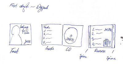
The following is a rough sketch of our planned digipak which will consist of a cover, tracklist, CD, back cover, and barcode.


Tracklist
Most of these song names we came up with on the fly. Here are a list of suggestions for song names. We will only choose around 5-10 of them that we'll use for our digipak.
  • Looking for Love
  • Leave the Door Open
  • Somebody Save Me From Love
  • I'm Lonely
  • Love, From J
  • No More, I'm in Love
  • Why Darling?
  • Who's Jack?
  • I Will Write
  • Call Me
  • Losing Hope
  • Love Hates Me
Of course, we picked "Leave the Door Open" as it is the main song we are doing the music video for. 
The ones we highlighted in blue are the other song titles that will be included. To our knowledge, there aren't any songs that we know of that have the same titles as these. 

Album Name
Most of these album names we came up with in 5 minutes of thinking. Here are a list of ideas.
  • Looking for Love
  • Leave the Door Open
  • I'm Lonely
  • From J
  • Why Darling?
  • You
We picked "Looking for Love" because it seems to perfectly encapsulate the persona of JMUSE which is a hopeless romantic looking for love as well as how it summarises all the songs into just three words. It also helps that it is the name of one of the songs on the tracklist too. 

Our teacher also gave us feedback regarding our album name and he said it has to be the same song we are making the music video for so that's why we changed it to "Leave the Door Open". We did all the work below this with our original ideas before we got this feedback from our teacher. 

Digipak Cover


Here are some fonts that we looked at for the album name. We used serif fonts because that's the convention of the genre we looked at. Ultimately we couldn't decide on which font to use so we decided to have a look at them on the digipak drafts. Here are a list of designs we came up with. 


Here are some drafts we did on Microsoft Powerpoint. After some long hard thinking and consideration we brought it down to just two typefaces: Sticky Sugary which is the serif font and Dharma Gothic E Heavy for the thicker font. We stuck with the navy coloured font because we believe it goes very well with the rest of the picture as well as the branding and person of JMUSE. In the bottom right you are able to see the logo of JMUSE in both Dharma Gothic E Heavy font which is part of JMUSE's branding. We experimented with the placement of all the text and came to the conclusion that the one with the green circle was the best one. 

Choice:


We chose this design because it fits JMUSE's persona of being a bit of a goofball, hopeless romantic, teenager just looking for love. His facial expression and clothing make it look like he really is trying hard to make an impression on someone he may find special to him. The background also is good as it is easy to integrate it into other parts of the digipak such as the reverse cover and the inside content. 

After having received feedback from our teacher, he said it does not conform with our branding of JMUSE and looks nothing like the music video, especially with the colours. We decided to standardise the font and use Sugary Dreams as the font. Our teacher also gave us the following rough draft to help give us a much better idea of where we should be in our digipak development.


Here are a line up of drafts we made for the new digipak.


Ultimately we made these changes because of how our previous design was not really all that good according to our teacher and did not conform with our genre conventions like we previously thought. We went with the first design as it emphasised the laidback and chill persona of JMUSE. This font is Sugary Dream and conforms with JMUSE's brand identity.


One thing I forgot to include in the drafts was the JMUSE logo which I corrected here. 

Tracklist
We decided to experiment with the typefaces a bit by just having a look at what Times New Roman would look like incorporated into this design. Our genre conventions tell us that there is no picture or illustration of the artist on this part of he digipak but rather it is either blank or has a tracklist which is what ours has. Below are a few drafts we made on PowerPoint.


We experimented with this design with the background of the photo of JMUSE. We decided to stick with the serif fonts for the tracklist after experimenting with a san-serif font and seeing it did not fit the genre conventions. 

Below is what we agreed upon as the tracklist.


We went with this one because it was easier to read.

Upon receiving feedback on our previous design, our teacher (as per stated above) also told us to revise our design because it does not fit with the artist's persona and branding. He gave us ideas such as to include a beach picture here. Another thing he said is that outline on text is bad graphic design.

Here are a line up of some drafts we made.


We picked this photo because it is in line with our teacher's feedback. The mise-en-scene of the couch conveys a sense of laid back and relaxation as well as luxury in that shade of green. 

Below is our final pick.


CD Cover
We made some mock ups of CD Covers that we believe conform to the genre conventions of an R&B digipak. Here are a few of those drafts we made on PowerPoint.


We went with the design encircled because of how the other ones looked. The highlighting of JMUSE's logo in white really stands out on the CD Cover and looks a lot better when the font is on the diametre of the CD rather than at the bottom or top of the CD. The colour fits the branding of JMUSE which is dark blue. 


Upon receiving feedback on our previous design, our teacher (as per stated above) also told us to revise our design because it does not fit with the artist's persona and branding. He gave us ideas such as to include a beach picture here. Another thing he said is that outline on text is bad graphic design.

Here are a line up of some drafts we made.


We used this image because it is the other half of the image cut in half used for the tracklist.

Reverse Cover
We didn't do this before getting feedback from our teacher so that's why there isn't a draft for a really poorly designed reverse cover. This time we really did conform to the R&B conventions of a digipak according to our teacher.


The reverse cover is the other half of the front cover. The dotted line is for reference only where the border of the spine and reverse cover is. We decided to go with the third option because it is the only design with the tracklist. 

Here is the final pick


Self-Reflection:
I didn't really contribute much in this project, all I did was just give some ideas for the background of the digipak and provide links and website for Carrick to design the Digipak. I must be genuinely honest that I'm really thankful and appreciate that my friend's have carried me in this blog post since I was set to do another task. To sum it up, I did minimum work on this blogpost, all I did was just giving background images and ideas for Carrick to apply to the Digipak.